


A Foolproof eCommerce launch checklist.
![]() Taru M.
Taru M.
Published: 05 Jul, 2022
Table of contents
1. Make the home page, about us page, and other standard pages meaningful.
2. Make listing pages easy to process for users to make them discover what they need quickly.:
3. The Shopping Cart page is where shoppers finally decide to purchase products.
4. Add the following to the eCommerce launch checklist as well
You have been patiently waiting for the day to launch your eCommerce online store after several months of hard work – perfecting UX, optimizing performance, creating marketing strategies, A/B testing User Interfaces, and finding technological solutions. It is then vital to spend some more time going through a comprehensive eCommerce launch checklist. It will ensure every element is working orderly and is ready for the huge influx.
The process is similar to when mountaineers prepare for months for a long journey to climb a steep and dangerous mountain. Before starting the journey, if mountaineers don’t take time to review tools and strategies, there are chances they may lose their lives.
Let’s start the review with the landing page – the first impression of your online store to the world.
Make the home page, about us page, and other standard pages meaningful. [Use storytelling]
Home Page
We have become accustomed to infinite scrolling patterns. Social media companies have made us sort of conditioned to scroll vertically. Consequently, eye-tracking studies show people now spend 57% of their screen time above the fold ( section of a webpage that people see without scrolling down) compared to 80% in 2010. On average, people give 74% of their attention to the first two sections of the home page.
That means above the fold is still quite relevant for an eCommerce website. Hence, ensure the main tagline or selling point is clearly visible there. Also, it should contain a high-priority CTA (Click-To-Action) button.
Review the page length. If you haven’t tested it on real people yet, then do it urgently. Make sure your home page has proper signifiers like the cut-off text to indicate that there is content below the fold as well. Technically, it is called the illusion of completeness, the term coined by Bruce Tognazzini.
Oftentimes, we use stock graphics or images that don’t add value. It is needless to say digital business demands unfettered user attention ( good or bad is a matter of serious debate). But those images only act as embellishment. Often, their use results in distractions for the users.
Edit cold-bloodedly. Do you know, what costs the companies to bleed money? It is not bad navigation or bad category pages. The culprit here is bad content. What do you need to do? Don’t add fluff on the homepage.
When you are designing a long home page, do add a search box. User experience studies advise creating a search box with no less than 27 characters. Another small mistake that we make is to add a link to a home page when the user is on it already. Many times, it creates confusion about their current location.
About Us Page
This page may seem insignificant to many but the About Us page is crucial to communicate credibility to your users. Besides, to make your website discoverable on the web, search engines like Google recommends making the About Us page genuine to leverage its E-A-T principle.
As we mentioned above, people spend a majority of the time above the fold, therefore the first two sections should have the most critical information about your company. Ensure the content is properly formatted to reduce cognitive load.
HomoSapiens are hardwired for storytelling. So, why not tell an engaging story about your company? But avoid cliches like ‘revolutionary’, ‘best company’, etc. People are bored of such kinds of ‘revolutionary companies’. Find out why your company is unique and express it clearly with no fluff. Add photographs of the significant people running the organization and what they do to add texture to your unique story..
What adds to the woes of the users? Not being able to find quick answers to their questions or curiosity. To truly make them happy, don’t make them wait or dig deep for critical information.
Contact Page
People’s queries, if left unsolved would make them switch. So, before launching your eCommerce store, ensure the Contact Page follows the proper UX guidelines.
People generally look for the ‘Contact Us’ label either on the top or in the footer. Therefore, don’t hide it under drop-down menus or in places where they can’t locate it swiftly. Doing so will result in a loss of credibility.
Add the main contact number/s and let the calls be handled by trained people as they represent the whole company. A user may be your potential customer or existing user who is into some trouble. They expect empathetic listening. That is why ensure the company’s representatives are skilled conversers. If your company has too many contact numbers, then organize and label them properly to help people find the right one in no time.
But never mix the main contact numbers with supplemental ones.
Include corporate address, email address, fax numbers (if it is needed in your business) and physical store addresses. Don’t forget to link addresses with the navigation apps like Google Maps.
Including Live Chat seems lucrative but implementing it is not straightforward. As it requires lots of optimization and testing. Nevertheless, straightway inform users whether a real person or a bot will interact with them.
Contact forms must never be a replacement for phone numbers. Apparently, people are averse to filling out contact forms as they fear the company will bombard them with unintended advertisements and other stuff. If you do include them, don’t make the fields like ‘Name’ restrictive i.e. if they don’t use their full name, you shouldn’t force them to include it. And don’t try to collect personal information like address and phone number.
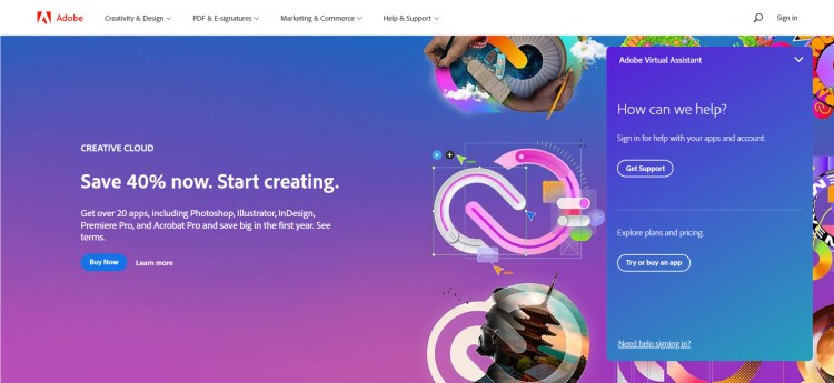
A quick tip if you want to irritate your customers. Force people to make an account to access help and contact information. And you may be wondering who does this? Adobe. See it in the screenshot below.
FAQs
FAQs besides reducing the burden of customer support, if done properly can express the values of your company. Studies, too, indicate that customers don’t merely use FAQs to resolve their queries. They also judge the whole organization from how well-executed the FAQs section is.
So, design FAQs to exemplify your understanding of customers and how your product/services can make their life fun. Pay attention to the following to check the effectiveness of FAQs:
- Latest, honest, and credible information.
- Do they appear promotional, or genuinely designed to help people.
- Easy to read with correct grammar.
- Uniqueness as well as limitations of your product.
FAQs are great to bring organic traffic. If your FAQs are well-researched and match the intent of people’s queries on search engines, you can potentially attract loads of customers. Additionally, you can link them with internal or external useful resources. This will add depth and ultimately enhance trustworthiness.
Other standard pages to check properly before you launch your eCommerce store:
- Terms of Service
- Privacy
- Refund Policy
Make listing pages easy to process for users to make them discover what they need quickly.
A good Product Listing page (PLP) will help people find the product they need with ease. Trends show consumers expect useful product information on PLP itself to make better decisions before moving to actual product pages. Moreover, if consumers didn’t quickly find the product they want to purchase, they would infer the site doesn’t carry the product.
All communication over the web happens through text. Consequently, concise and orderly content reduces the effort on the part of users to make decisions.
That is why clear and descriptive labels are a must to help them navigate. So, stick to words actually used by your users rather than being clever. People just skip over meaningless labels. Very rarely, they will click to find out what’s inside the label. For example – users are often confused between ‘Solutions’ and ‘Support’.
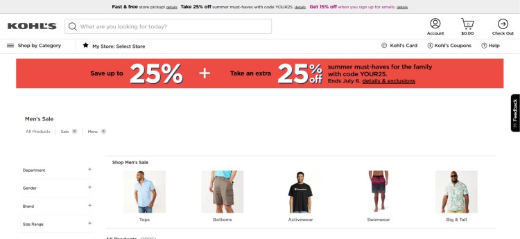
If your product fits into different categories, then you can include it under relevant parent categories. This will make Information Architecture (IA) more impressive and useful. Make certain that you don’t add that product in every category you feel sounds relevant. It will unnecessarily make product menus long. The best solution, here as elsewhere, is ‘user-testing’. You will get to know under which category or label users instinctively look for a product.
Meaningful meta-description of products results in an increase in conversion rates. To enrich product descriptions, add the following if it is applicable to your online store:
- Photos big enough for both aesthetics and enhancing user experience, Customers don’t want to go back and forth between listing and product pages.
- Use of filters to narrow down the customer’s choice. If you place a filter at the top, then make it sticky so it doesn’t hide when the user scrolls down.
- Mention variants like color, style, dimensions, etc.
- Customer ratings.
- Filters such as new, popular, on-sale, find similar, etc.
- Stocks left and whether available in physical stores.
- Quick-view feature for the product description without loading a new product page.
- Showing multiple images through hover or carousel.

Make product pages convincing if you dread returned packages.
Product page design shouldn’t be done hastily. This means not copying other product pages. Customer research done correctly will reveal what are the most relevant points that should be mentioned to help users make an informed decision. A poorly designed product page will lead to more returned packages harming your online store’s reputation.
To begin with, check if your products’ names are clear causing no confusion or ambiguities. Product pages have the purpose of giving correct information about the products. This means writing concise and descriptive product descriptions. Avoid promotional vocabulary in the descriptions.
Some of your product items may have terms that are crucial for customers to know before they make the purchase. A simple explanation of these unknown terms will strengthen your store’s authenticity.
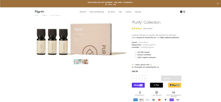
Product images have a significant role in conversion rates. Simply because users cannot physically touch, inspect and feel the texture of the items. So, put time into making product photography not only visually appealing. Add images from multiple angles, animated views, enlarged images, and images in context – this particularly helps customers to see use cases of the products.
Reviews help users know the product’s features as well as its use cases. But consumers often jump to negative reviews before positive ones to get a clear understanding of the pros and cons of products. Therefore, adding filters to get quick summaries of reviews will benefit users a lot. Over the years, consumers have learned to not blindly trust reviews. So, for improving the trustworthiness of reviews you can, for example, include the reviewer’s age, and demographics, and verify the reviews.
Your product pages must include the following:
- Uncomplicated product’s name
- Comprehensive images and its enlarged view.
- Princes including discounts, shipping charges, etc
- Product’s variants – size, colors, etc
- Jargon-free product description.
- Clear feedback when a product is added to the cart.
To further enhance your product pages, you can consider the following:
- Consumers and expert reviews – both good and bad
- Videos and contextual product images
- Product Recommendations
- Buy later option
- Use of AR for live-viewing
- Step-by-step videos for setting up the products
The Shopping Cart page is where shoppers finally decide to purchase products.
A shopping cart page includes all the products a customer has shown interest in. The UX principles when applied to this page help customers in a quick review and making final decisions for smooth checkout flow. As a result, your site encounters low cart abandonment rates. Over time, it may even lead to more conversion as you can use the data for personalized marketing.
Nowadays, some e-commerce websites display a shopping cart as an overlay or part of the checkout page. This approach is not as robust as dedicating a full page to the shopping cart. The mini view of the shopping cart offers limited editing access which is so important for customers before final purchase.
Designing a separate page assists users to remain focused during the checkout flow because there is little need to go back to product pages for editing. Here as elsewhere, check the conciseness and clarity of product details. Characteristics of an item like color, size, availability, price, estimated shipping delivery, etc aids customers in do a final comparison.
The use of large enough images for easy differentiation among similar products is essential. Also, check if the image of an item is the same as the one on the product page. Consistency is so crucial for both customer experience and brand identity. The purpose of the text and image on the shopping cart page is to give users a concise summary of their added items.
Another useful but overlooked usability principle is to link both the product’s image and name to the product page. Sometimes, customers may need to recheck some product details before moving to the checkout phase. In those scenarios, linking to a product page saves the user’s time and effort. Ensure hyperlinked text has a different color or style for easy recognition
Don’t be frightened to add a clear “Remove this product’ label. It may seem foolish to add this label when the whole point of a shopping cart page is to increase the conversion rate. But making it difficult to remove items would fall into a UX dark pattern which in our experience must be avoided. To read more on dark patterns visit our blog.
Web Development After 18+ Years: Don’t Make Dark Patterns
Design a shopping cart page that assists customers in reviewing items, estimating total costs, and editing their choices – all without pain and saving their time.
Add the following to the eCommerce launch checklist as well:
- Checkout pages. 69% of customers abandon their purchase at the time of final checkout.
- The technical side of SEO.
- Customer support
- Third-party apps for enhancing functionalities like connecting stores to social media, email marketing, etc.
- Adding analytics to gather useful insights about consumer behavior
- Adding user-friendly and reliable payment methods.
- Digital Marketing. Almost 9 out of 10 eCommerce failures are because of unfocused online marketing.
Our eCommerce development company has skilled visual and UX designers and developers who know the latest tech and trends to develop your eCommerce business. We are eager to use our skills in creating fine online stores.

Taru M.
For over 18 years, Taru M. is a successful technology entrepreneur by profession and a tech enthusiast by spirit. She takes pride in offering expertise in her domain to business people's success across the globe. As a business woman and technology expert, she manages to keep her balance along with her family responsibilities. She did her masters in computers, and her work delivery shows the expertise of her education. Connect with her via Linkedin profile to know more about her exciting personality
Contact Us

USA

INDIA
follow us on:


CANADA

follow us on:
Copyright © 2023 NetMaxims Technologies Pvt. Ltd.
All Rights Reserved