5 Impressive Human-Centered Design Examples
![]() Taru M.
Taru M.
Published: 31 Aug, 2022
Human-Centered Design essentially means to design from people’s perspectives. This approach encourages designers to adapt methodologies that keep the end-user at the center of the designing and development process.If we look back, the emergence of design thinking can be traced back to the 1950s and 1960s—as a way of solving complex problems. Although it was only in the 1970s when cognitive scientist and Nobel Prize laureate Herbert A. Simon expanded on the foundational principles of design thinking.
Table of contents
1. What happens when designers fail to follow a Human-centered Design process?
‘Human’ in Human-centered design thinking is representative of ‘humanizing’ the design process. It urges designers and developers to observe, learn and take advantage of people’s patterns, biases and judgments and build around these with empathy.
We have numerous Human-centered design examples which prove why it is essential for product designers—or more broadly, a mobile app development company to keep the interests of humans to navigate the design and development process and why a Human-centered design approach is essential for business success.
What happens when designers fail to follow a Human-centered Design process?
Google+ was Google’s infamous attempt at social networking, failing because it did not adopt a Human-centered design approach.
Google+ was launched in 2011—when Facebook and Twitter had already captured a significant fraction of the social networking market with their web platforms by aiding humans with their revolutionary and out-of-the-box communication services.
Google’s application was an invite-only platform that allowed users to post pictures, update statuses, categorize friends in ‘circles’ and make group video calls using ‘Hangouts’. But people already had Facebook to connect with people. Moreover, it was confusing for people to use the ‘circle’ feature—even though it was an exciting feature, it was complex and confusing for people to use, and the same was the case with sharing images, links, and posts.
Despite multiple efforts from the tech giant to increase user retention and engagement at the platform, it finally bid adieu to Google+ in 2018 after reporting two bug breaches.
An important step Google failed at was conducting legible user-centered design research to understand what its customers needed. The services they aimed to provide to their customers were already being met on another web platform.
Ironically, another example—which, in fact, is a digital feature—that has been profoundly successful for tech companies is the ‘infinite scroll’ feature. The infinite scroll has helped tech companies such as Instagram, Facebook, and Twitter to increase user engagement on their respective platforms.
The infinite scroll feature hacks the users’ brains in such a way that the users can scroll endlessly as the platforms continuously load more content—which never stops. This feature was first thought of and developed by Aza Raskin in 2006 as an intuitive replacement for the pagination layout, which was toilsome for the users.
The pagination method allowed users to keep track of the amount of consumed content, but the infinite scroll feature doesn’t allow users’ brains to catch up with the amount of content consumed. Media companies actively use this feature to increase user engagement on their digital platforms.
The infinite scroll feature has become hazardous for humans’ mental health, making them addicted to these platforms. It plays with human psychology, which pushes them to consume more and more, or else they will miss out on a significant subject matter.
Despite the focus of this feature being to amplify user engagement and stress-free navigation, which it essentially did, it failed to have an empathetic approach toward the larger good of humans.
In fact, Raskin themselves says, “if you don’t give your brain time to catch up with your impulses, you just keep scrolling down”.
Human-Centered Design Examples
After discussing the failures of certain digital products above, let’s see how the Human-Centered Design approach helped the following brands to make a mark with their unique design methodologies.
Airbnb
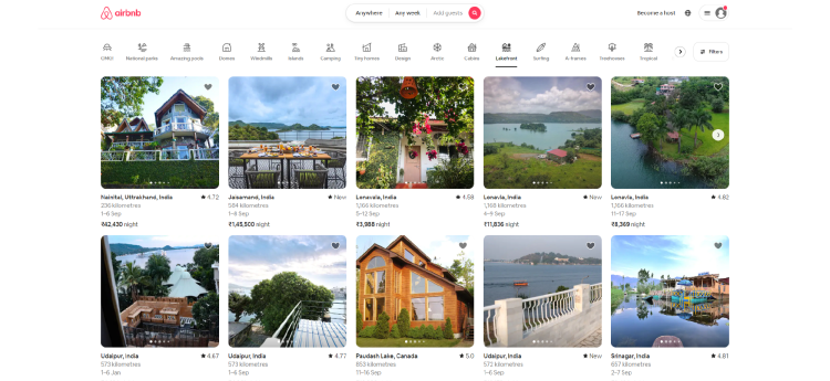
Founders of Airbnb were so close to failure when they decided to go against the customary Silicon Valley practice of performing only to earn profits. While pondering over the plausible reason which could be yielding results, they realized that the pictures used on their platforms weren’t very likable. Instead, property pictures were either clicked from phones or were images from the classifieds.
The bottom line was that people weren’t seeing what they were paying for, and unpleasant images were only making their case worse.
Paul Graham, one of the founders, decided to himself click the pictures of the customers’ listings from a rented camera and replace the distasteful images with high-resolution ones.
This simple technique started yielding results within a week. Thus, realizing that writing codes aren’t the only way to solve problems; they are just a part of it. Communicating with the stakeholders and understanding their needs and problems is what it takes for a business to grow, aka a humanized approach.
Complement with: What, Why, and How of the Minimum Viable Product Process?
Simple
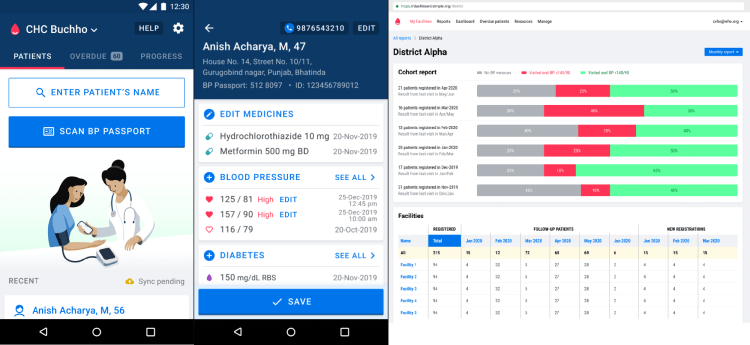
Simple is a digital platform to help people manage their blood sugar and pressure levels. Their target customer base includes both-healthcare professionals and patients.
Ease of use was the primary focus of the designers while developing the interface for Simple.
Since the software was to be used in an array of settings and by a variety of people (including professionals), the designers conducted in-depth user research with the Simple users. Their research methods included telephonic interviews with all the major stakeholders of the software situated in an array of settings which enabled them to have a subjective understanding of the diverse contexts of use.
Their design team was guided by a certain set of principles such as some of which are:
- No small text
- Mindful usage of Icons
- Display the entire patient information at once
- Designated color scheme
- Separate designs for different screen sizes
- Simple language
- Analyze user patterns
The developing team of Simple also understood the ramifications of the digital services and concerns regarding data ownership and privacy among their users. Since the application requires its users to enter personal information, it pays close attention to employing country-specific regulations and deploying entities (the state or central government).
Simple stores all their customers’ data encrypted in an inaccessible cloud. The Simple administrators can only access Metadata, which is further used to optimize the application. Moreover, their software is developed following the Principles for Digital Developement.
Since users of Simple mobile and web applications ranged from patients to medical practitioners, the developers and designers needed to build an interface that caters to users in various settings. Therefore, adopting human-centered methodologies and showcasing deep empathy was crucial to their product design process to deliver an all-inclusive, long-term solution and comprehensive application.
Bright Sky
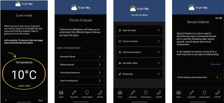
Content Design London designed a content prototype for the Bright Sky application and website. Bright Sky is an initiative by Hestia which provides information, guidance, and a directory, all within the purview of domestic violence.
The main goal of this project was to develop an inclusive content copy that addresses their audience coming from different backgrounds, experiences, and sexualities so that the content can be accessible to a much larger section of people.
Hestia’s design methodology rivets around the principles of Human-centered design. Therefore, CDL identified and interviewed stakeholders to understand their needs and what type of content would serve them better, thus adapting a participatory design approach.
CDL worked on self-assessment quizzes—using the forum language on domestic abuse—to help the victims reflect and evaluate their abusive experiences on a personal level. Naturally, there was a focus on continuously iterating the tonality of the content that is sensitive, inclusive, and considerate enough.
After content development, the team of CDL also conducted usability sessions to understand the users’ viewpoints with respect to refurbished content design.
CDL’s cautiousness and observant attitude towards stakeholders and their plight helped them curate content that addresses their problems and simultaneously empowers them.
Muse
Ink and Switch decided to design and develop Muse- a design studio application for iPad. Their core idea was to develop a repository platform that renders a free-thinking space for all the creative inputs that enables users to be fast, fluid, and easy to navigate for users to gather their ideas.
With the motive to implicate personalized and unstructured thinking spaces for creative people. The idea is that these physical spaces are chaotic yet organized in a way known only to the creator, which helps them to capture and channel their thoughts in a raw and playful manner.
Realizing that all the existing digital workspaces urge the creator to be organized, eventually limiting their sense of creativity, Ink and Switch started building the Muse prototype.
Their first step was to build on their foundational project—Capstone. Which was an experimental tool for Chrome OS tablets that enabled the users to collect raw material on their desktop computer and offered tools which can be used for thinking and brainstorming.
With certain design goals in mind, the designers began prototyping the application for iPads with styluses. Owing to their previous experience, the design team had specific design goals in mind with respect to the application, such as:
- The application should act as a bank for all the creative inputs for the users
- Multimedia support
- The application interface should be freeform, allowing fluid arrangements of data, notes, excerpts, images, etc.
- Provision of marking, aka inking everywhere
- Provision of excerpting
- The application should be in pace with the “natural speed of thought”
- Allowing 10-finger command input along with stylus input
After defining their designing principles, the designers and developers were also mindful of common problems faced by the users, such as problems of lost and broken styluses, complexities with importing and exporting files, storage, and difficulty in text entry.
The design team continued to build prototypes based on extensive human-centric research and also conducted extensive beta testing among their stakeholders before launching the final product for the larger set of customer base.
The owners of Muse built on the simple idea of humanizing the creative process digitally.
Zero Fasting app
The degree of lifestyle changes human beings have undergone is incomprehensible. With lifestyle changes accompanied by dietary changes, in the long-term, have had their own set of repercussions on health.
With people becoming conscious of their health, it is first important for them to truly understand their body needs as an individual.
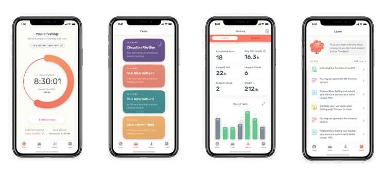
Keeping these needs in mind, Mike Mase, founder of the Zero fasting app, built the Zero fasting application. But his human-centered approach paved a fruitful way ahead for him.
The upgraded version of the application—version 3.0, was built in partnership with their users. As per their users’ needs, users can now sync their data in the cloud, provide more comprehensive guidelines and insights on the fasting journeys, a better tracking interface where you can check the progress of the users around the world, more fasting options, etc.
The Zero fasting app is quite good
— Elon Musk (@elonmusk) August 28, 2022
The application also offers access to knowledgable articles, blogs, studies pertaining to health, podcasts, and videos from renowned leaders and experts of health around the world. These resources helped their users to make conscious decisions on their fasting journey.
All the latest additions to their application were incorporated after analyzing the feedback collected from the application users. They also created beta testing groups, accumulated their feedback, and kept iterating their designs to better suit the needs of their users.
The examples mentioned above prove that a human-centered approach is the key to a long-lasting relationship with the users. As a product owner, if you are empathetic towards your users’ problems and needs, and their satisfaction is your end goal, writing a bunch of codes is only a means to achieve that goal—the real work is to establish a relationship with your customer base and adopt methodologies to research and understand their subjectivities and wants.
Copyright © 2023 NetMaxims Technologies Pvt. Ltd.
All Rights Reserved


